It was such a lovely day here, I decided to go outside and do some painting(drawing?) with a set of oil pastels I have in my stash. It was easier than using paints, which would have dried too quickly in the sun. Birds are so hard to draw from life - they flit around so fast it is hard to catch them in one spot long enough!
This apple and flower were taken from a tutorial in a book on using pastels.
Tonight was the fifth class in the Acrylics workshop. Michael hung a white sheet over a rope, and instructed us to paint it. When we'd finished, he showed us how to turn it into a coloured sheet, painting a colour wash over the original black and white toned painting.
I've had pencils in my hand ever since I can remember, and as a child, colouring in books was my favourite activity. I've since graduated to calligraphy, and dabbling with various paints, pastels, charcoal, etc. I also like to play with paper, recycling things and making collages. This is a record of my projects in recent years.
Tuesday, March 20, 2012
Thursday, March 15, 2012
Portraits.
Our Acrylics art class tutor asked us to paint a self portrait for our homework. I did mine today. It's a bit tricky looking at yourself in a mirror and trying to paint at the same time. He warned us not to try and beautify ourselves; just paint yourself warts and all, he said. Well, I tried to paint what I saw, but it is true that we don't see ourselves as others do. Most people see themselves in their mind's eye as younger/thinner/prettier/uglier than they actually are. I've always been told I don't look my age (64), but I'm not really sure how old I look here!
We have a friend who is a Native American Indian and I asked his permission to paint his picture from a poster he gave us. He was happy for me to do so, and today I started experimenting on a small piece of paper (octavo size). It's out of proportion in many parts, but I wasn't trying to get it right this time, as all I wanted to do was attempt to paint the sunset. Got a way to go!
Tuesday, March 13, 2012
Sketchbook Challenge March.
The theme for March is flowers. I did a few sketches of various flowers in pencil, then tried painting the beautiful red petunias in our front garden. Just as well I did, because the possums ate them two nights later!
While I was in the back yard sketching flowers, Ken let our chooks out of their house for a roam around on the grass, so I took the opportunity of making a few sketches of them. Then I drew Ken while he was doing some work on the aviaries.
Monday, March 5, 2012
Fourth night of Acrylics painting class.
Michael was pleased with my homework from last week (the black and white rose and the landscape in green), and suggested that I make a few improvements to both pictures by putting a glaze over them, then a light colour wash. Sounds interesting, so I'll try that in the next few days.
Tonight, he put an image of Van Gogh's painting "The Bedroom" up on the big t.v. screen in our studio, and put us all to work painting a copy of it. Some bright spark suggested he turn it upside down, so he did. Thanks, bitch. Don't know about the others, but I would have found it a lot easier to copy the right way up. Yes, I know someone wrote a book about artists using the right side of their brain or something, but did we really need to go down that path?
Everyone else was using their large A3 size painting pads, but I chose to use one of my smaller ones (12 cm x 18 cm). I've only got small tubes of paint, so I'm trying to conserve them! Michael was amused and called me his miniature painter! This is the painting we had to copy - this one is taken off a website, but I don't know where Michael got his image from, as the colours were quite different.
My version:
He did warn us that different websites have varying colour images. He urged us to use our paint with less water or medium, to create a more intense colour the way Van Gogh did. When I thought I'd done enough, he came over and added a few bits of colour here and there, and made a couple of suggestions which I followed. At the end of the session he put my little painting up on a ledge to display - I was quite chuffed!
Sunday, March 4, 2012
Sketchbook Challenge
I was looking on the web for online tutorials about painting and drawing (there are thousands of links!) and I came across this interesting blog. The authors suggest a new theme each month, and the blog followers do something with that theme - draw, paint, stitch, etc. It sounded like a good way to get me drawing something new regularly, which I'm told is the way to improve my skills - practice daily! Well I just don't get time to draw every day, but once a month, yes I can do that...in addition to the painting class homework.
The Sketchbook Challenge has it's own Flickr pages where the members can post photos of their new sketches each month. It is fascinating to see how everyone else has interpreted that month's theme.
January's theme was Doodling, and February's theme was Close up.
I chose to doodle with a red pen and lettering, which is what I do if I am mindlessly doodling - usually letters and words.
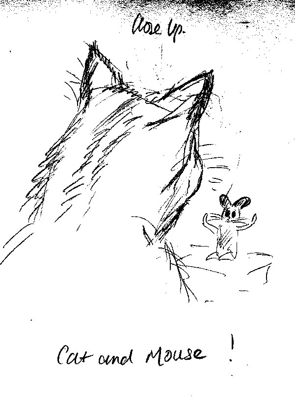
Close Up was done while my cat Tiger was sitting up close to me, watching an insect or something on the ground, and I added the Mouse figure just for fun.
The theme for March is Flowers - that will be a serious challenge for me, as I am not good at all with flowers or trees!
Saturday, March 3, 2012
Acrylic art class, third week.
Our homework this week was to do a painting using just black and white and grey tones. I painted this rose, which is based on a project by Amanda Shepherd in a recent issue of "Aust.Find Art & Decorative Painting" magazine. My hurried version doesn't do her original picture justice! But it was an interesting exercise.
We were also asked to do a picture using just green, tinted with black and white for effect. I saw a painting in a tuition book, done in a few colours, but I thought I could modify it to suit myself. Just a stream running through a landscape with a tree.
Then because I still had some colours on my palette, I used them up on a small black visual diary I'd been given. I'm learning to appreciate playing with paint, which is what our tutor is trying to instill in us, I guess!
I've just been re-reading my notes from that class, and I think Michael said we could add another green if we wanted to. Mmm..I might play around with this picture. But after the next class, when he's seen this first.
Tuesday, February 28, 2012
Rainbow Lorikeet drawing.
On Sunday, I attended another workshop presented by Janet Matthews, who taught us to draw Owls last year. Above is my drawing, and the photo that Janet provided. I'm not happy with my drawing; the perspective is wrong, and the bird looks elongated. I used the colours that Janet suggested, but the photo is not good to draw from, as it was taken in bright sunlight, and the parts of the bird in the shade are so dark you can't see what colour it is.
I would like to do this again, but using a better photo, and perhaps in oil pastels, to try and capture the brilliant colours of the feathers.
Last night was the third class in the Acrylics course. Michael talked about tones, shades, tints, etc., and demonstrated how colours can be changed by adding black or white. He got us to paint a chart of tones from black through shades of grey to white. Then he spoke about the colour wheel of primary colours, and how secondary colours are made from that. We then had to paint our own version of a colour wheel, blending our paints to come up with secondary colours, and then blending those with white first, then black, to create even more tints and shades. I painted along with the others, but threw it out when I got home, as it wasn't worth keeping.
It was interesting to some of the class, but I have a good knowledge of that through reading books over many years, so I didn't learn much. I 'threw' Michael a bit when I challenged him on the use of blending primary colours. I said not all blues and reds make purple, it depends on whether the red and blue are cool or warm shades. He agreed, but he said it was getting a bit too technical for our class at the moment because he just wanted us to focus on doing what we could with the primaries we had on hand. Later on he said that I obviously knew more about colours than the others, going by the questions I was asking, and I admitted to him that I wasn't learning much. I said I probably should have chosen another type of class more foccussed on drawing and design, rather than just playing with colours. I didn't say it in an offensive manner! He was sympathetic, and knew what I was trying to say. He said he would spend a bit of time working with me on anything I wanted to learn in particular, which was nice of him. He really is a friendly and helpful guy - he just approaches art from a different perspective from me!
Our 'homework' this week is to paint a picture of anything we like, using only black and white to created shading. We can also try to paint a small picture in only green - toned up or down with black and white paint, and including one other green (cool or warm contrast).
I would like to do this again, but using a better photo, and perhaps in oil pastels, to try and capture the brilliant colours of the feathers.
Last night was the third class in the Acrylics course. Michael talked about tones, shades, tints, etc., and demonstrated how colours can be changed by adding black or white. He got us to paint a chart of tones from black through shades of grey to white. Then he spoke about the colour wheel of primary colours, and how secondary colours are made from that. We then had to paint our own version of a colour wheel, blending our paints to come up with secondary colours, and then blending those with white first, then black, to create even more tints and shades. I painted along with the others, but threw it out when I got home, as it wasn't worth keeping.
It was interesting to some of the class, but I have a good knowledge of that through reading books over many years, so I didn't learn much. I 'threw' Michael a bit when I challenged him on the use of blending primary colours. I said not all blues and reds make purple, it depends on whether the red and blue are cool or warm shades. He agreed, but he said it was getting a bit too technical for our class at the moment because he just wanted us to focus on doing what we could with the primaries we had on hand. Later on he said that I obviously knew more about colours than the others, going by the questions I was asking, and I admitted to him that I wasn't learning much. I said I probably should have chosen another type of class more foccussed on drawing and design, rather than just playing with colours. I didn't say it in an offensive manner! He was sympathetic, and knew what I was trying to say. He said he would spend a bit of time working with me on anything I wanted to learn in particular, which was nice of him. He really is a friendly and helpful guy - he just approaches art from a different perspective from me!
Our 'homework' this week is to paint a picture of anything we like, using only black and white to created shading. We can also try to paint a small picture in only green - toned up or down with black and white paint, and including one other green (cool or warm contrast).
Thursday, February 23, 2012
Acrylic art class homework, second week.
For our homework this week, the tutor instructed us to get used to working with our paints, by just painting something - anything. He said "go out your front door and paint a landscape! A tree!" I took him at his word and took my paints and paper up to the back yard this afternoon. I've made myself a viewer - piece of cardboard with the centre cut out, leaving a 'frame' which I can look through to isolate the area I want to draw. I chose a corner of the yard that has an old tree and some small shrubs up against a paling fence. The chooks were scratching around while I was painting, so I put a little black hen in my picture.
Still not marvellous, but I'm getting the hang of using paint instead of sketching.
Tuesday, February 21, 2012
Acrylic Art lessons 1 and 2, February 2012
The first painting is my first attempt on the first night of the course. An orange towel with two blue-green upturned plastic tumblers and two limes. I got the perspective all wrong, as well as the colour of the towel, which was more apricot than orange. I needed some tuition in blending colours!
I re-did the first painting from memory - instead of painting the towel draped all the way across the table, I just had part of it where the tumblers and fruit sat. Layout a bit better.
We were told to practice at home with some still life items, then bring them to the next class to paint them again. This is what I did at home with a plastic lemon container, a vase and an origami box, on a piece of pink fabric. The actual vase is pink, but I changed it to brown, because it got lost in the fabric colour.
I took the lemon and the vase to class, but changed the box to a small tin. I wanted to have three different shapes to paint. My first attempt was pale and washed out. The tutor suggested using less medium and more paint to produce more colour. I wandered off and went back to it several times, each time adding some colour. I still don't like this, but at least it now has some depth.
What have I learned so far? The use of Titanium White to lighten other colours, the use of water or medium to dilute colours to a point of transparency like water colour, and using Gesso to coat the paper I am using to improve the surface for use of acrylic paints.
We have also learned a bit about mixing primary colours to make secondary colours, which most of us knew a bit about already, but he then told us that some colours simply cannot be mixed from certain blues, reds and yellows, given the variation between warm and cool tones.
I re-did the first painting from memory - instead of painting the towel draped all the way across the table, I just had part of it where the tumblers and fruit sat. Layout a bit better.
We were told to practice at home with some still life items, then bring them to the next class to paint them again. This is what I did at home with a plastic lemon container, a vase and an origami box, on a piece of pink fabric. The actual vase is pink, but I changed it to brown, because it got lost in the fabric colour.
I took the lemon and the vase to class, but changed the box to a small tin. I wanted to have three different shapes to paint. My first attempt was pale and washed out. The tutor suggested using less medium and more paint to produce more colour. I wandered off and went back to it several times, each time adding some colour. I still don't like this, but at least it now has some depth.
What have I learned so far? The use of Titanium White to lighten other colours, the use of water or medium to dilute colours to a point of transparency like water colour, and using Gesso to coat the paper I am using to improve the surface for use of acrylic paints.
We have also learned a bit about mixing primary colours to make secondary colours, which most of us knew a bit about already, but he then told us that some colours simply cannot be mixed from certain blues, reds and yellows, given the variation between warm and cool tones.
Saturday, February 11, 2012
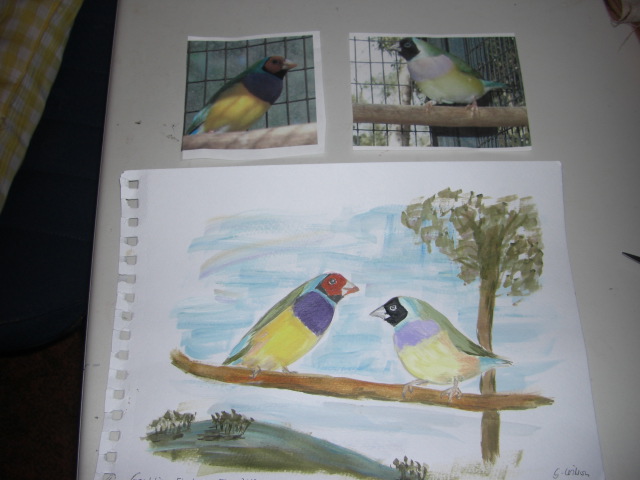
Gouldian Finches in Acrylic paint.
I painted this picture when I first bought some tubes of acrylic paint, just to try it out. I painted the birds from two photos of birds from our aviaries. It is okay, but I feel there is something missing; it looks 'flat'. When I showed it to our class tutor, he agreed - there is no life in it because it is painted from a photo and not real life. I reminded him that it would be almost impossible to paint these birds from watching them, as they fly around so fast, not sitting still for long. He didn't comment on that.
Saturday, January 21, 2012
Drawing with colour pencils workshop 2011.
Janet Matthews was our tutor for this one-day workshop at the Light Factory in Eltham late last year. She gave us this picture of an owl to draw, then went through the process of using colour pencils step by step.
Subscribe to:
Posts (Atom)